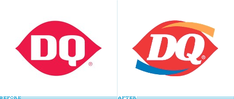
It’s a shame how Dairy Queen just ruined their good old logo with a new horrible design. DQ’s traditional logo was “unique, memorable and impactful” and very easy to recognize. Why on earth did they have to add these extra curved swishes?

[via underconsideration]


THAT is HORRIBLE! It was fine the way it was!
Brutal colour combination
It’s truly ugly.
Just the letters done differently like they are would have been enough without the ugly added stripes!
Mist_ynight, yes I agree, the font change only would have been nice
Waitasecond … aren’t those swashes curled in precisely the way as the eyebrowse of the Qaquiotl sun god?…
I agree and as a Graphic Designer, I have to repeat that that is fugly.
I don’t even care for the font change. DQ can’t change. It’s been the same forever!
Ouch… I don’t like it… It burns…. 🙁
It’s strictly for marketing – because the new logo has “more going on” to catch the consumers eye – whereas the old logo is very plain and non-eyecatching – I think it works!
You’ve GOT to be kidding. Adding bells, lights and whistles don’t attract customers. If anything, this cheapens and weakens the brand, but because they’re a well known franchise they’re not going to lose much sleep over it…so long as they don’t mind being a laughing stock, that is. If they were a start up however, this identity would have certainly hurt their business more than helped it.
This is a joke right?
Hi there
I worked at a dairy queen untill just recently and if you notice the colour of the swishes they will indecate to the eater or drive by-er that they serve ice cream (blue swoosh blue being a cold colour symbol) and brazier side (orange swoosh) would indicate hot brazier food
their logo in store is “hot eats, cool treats”
What does “fugly” mean?
hehe that’s an embarrassing question
It’s a vulgar word that I regretted using but it was too late 😛
In answer to Danielle….Fugly a combination word meaning F@#$ing Ugly
Oh what the freaking ever. All this over a logo design. Do you think this affects the taste of the ice cream? Things change. Suck it up people.
I like the crisp clean logo of the original even if things do change however lol no it doesn’t change the taste of the icecream so I would go there just the same!
Where do I start
The new logo was put into place for the dq systems transformation into it’s Grill and chill concept. This concept is for a premium fast food/ice cream experience. Every Dq is required to change to this signage on there buildings by the year 2011. the swooshes are also used to liven up there commercials a little.
I agree to the average customer these changes will not be noticed and the extra 20k each franchisee has to pay for new signage is a joke
I really dont care wether they change it or not, we rarely ever go there.
As a designer myself, I am often asked to spruce up old logo’s, it’s ok to add a little bit of color, flare, uniqueness to a logo, as long as it doesn’t not massively change, the change to the logo is subtle, in focus, and as much as you all diss it, you’ll still go and eat that delicious ice cream they make. Hence the logo change didn’t effect your consumption of their product.
Good style may be wonderful to some, but to some others, it’s garbage. Trust us, we now have experienced our share of varying ideas on our very own design work…
I think that for a lot of us, the DQ logo represents childhood memories of ice cream and our memories are not to be messed with. I agree that it’s not the greatest logo makeover ever, and no, I don’t believe that it was needed. And, at the same time, it’s not going to impact my day to day life.