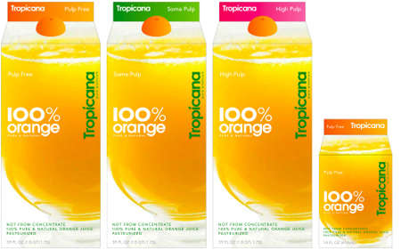
Tropicana has gotten a new look! Tropicana is part of Pepsi Co. so it seems like Pepsi is rebranding all of its products.
Here are rendered images of Tropicana’s new look [source]:
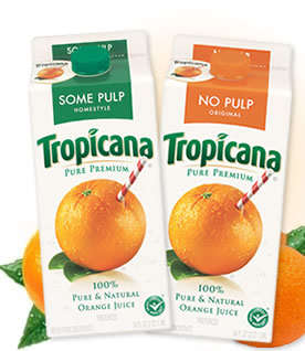
Although I found Tropicana’s old design to be slightly dull, it was very unique and easy to locate on shelves. I find the new design’s too cheap and feels like a no name brand.
Brandnew blogger has an interesting comment on the caps:Â “And I really want to believe that the screw-cap will not be an orange-colored boobie as in the rendering above.”
Here’s the old design:
What do you think of that new Tropicana design?


i like the old look better
I like the bright colours of the new design; however, I like the old design better! A combination of old design and brighter colours might be nice : P The new one DOES look like a no name brand (so do their new Pepsi looks)! Maybe all labels are moving towards the…what do you call it…minimalist design?!
lol…Boobie? Maybe they were going for something more like “half-an-orange”?
you TOTALLY called it there. it looks like a noname brand
Old look is way better….looks liks some cheap stuff. I would have bypassed it w/o buying had I not known
Reminds me of compliments brand…..
I like the old look better too…I think the straw in the orange is great marketing, too.
the new design looks exactly like a no-name brand 🙁
omg, did i just read orange-colored boobie????
omg boo..OMG *FALLSDOWNLAFFING*
I like it….looks like a big glass of orange juice and it contains all the info and none of the junk…
The old design was way better. And wow, did you ever nail it right when you said it looks like a no name brand *coughs* with an orange boobie lol
Yes, the old definately is better…what were they thinking?
weird. yep. i was JUST gonna write it looks no-name. at least it’s clean looking….
lol @ orange-coloured boobie.
But I agree it does look like a no-name brand. The old design looks so much better.
I have to disagree with everyone and say I LOVE the new design! I love the font, but then I have always loved that font. The whole design is so modern and fresh. Though the “orange-coloured boobie” is maybe a little too fresh…
I’m a big fan of packaging and advertising, so I give this a big thumbs up. It’s clean, modern, and fresh. I think it will be a bit of a shock to Traditionalists and people who don’t like change, but everything needs an update now and again! Remember, Cottonelle went to Cashmere, Electrosal is going to Finish… it’s just a change in packaging and I embrace it with open arms!
Before reading the post and the comments the very first thing that popped into my mind, like many others, is that it now looks like a cheap no-name brand of OJ. Being modern is fine … looking like no-name … not so fine.
lol @ Kate and the “orange-coloured booble” being too fresh. Maybe that’s the point. If you look at it from another perspective, the orange cap acts as though half an orange is being squeezed into the carton when you twist it off. Can’t get any fresher than that. 😉
I’m tired of ”modern” dont change a good thing!
ew i like the old look better!
i like the old.. there are too many varieties so this will totally get me confused in the supermarket .. the old one had BIG FONTS for the blue one I drink.. the +calcium type..
and the orange boobie.
teehee.
Boobie…LMAO!!! Maybe this will be a new type of comfort food.
And you’ll be paying more for the new design…. they’ve also shrunk the container, which means you’ll be getting less OJ. Instead of 64 oz, it’s going to be 59 oz, about half a glass less.
travel: they had to make room for the booby some how.
The new look is promoting what they feel is more important: 100% orange juice
Totally agree – the new design looks like no name
New look is totally “no name”. If anyone here teaches “Advertisng” as a course, here’s a good lesson in what not to do. Bring back the old easy to spot container.
Hopefully the investment on THIS change cost less than our last (Canadian) election….
I was reading your blog and you have some really good content thanks. Feel free to give me some feedback on how I can expand my writings some. Do you have any topics that I should cover…Let me know
is not that bad, but i think that Tropicana should keep the old design, an try this new one on a different product besides its original orange juice
I have been trying to register the pin numbers on the tropicana Carton for aeroplan miles. Your website is not permitting me to do this. Why???
Valuable information and excellent design you got here! I would like to thank you for sharing your thoughts and time into the stuff you post!! Thumbs up
I, too, was anti-prong. Maine Jeweler Etienne Perret makes attractive rings which are simple and psuedo-traditional, but unique. Mine is from him and I love it.